


JioMeet: UX Design, Interface and Design Psychology
First of all, I must say its an excellent effort to build a complex product like a video conferencing platform. Made available free for all Indian users. Great thinking Mukesh Ji!
When I read it on tech crunch “India’s richest man takes on zoom”
(I was like, wow! Finally, someone did it. Obviously, it’s a lot easier for a billionaire like Mukesh Ambani)
Like Zoom and Google Meet, JioMeet offers an unlimited number of free calls in high definition (720p) to users and supports as many as 100 participants on a call. And interestingly, it appears to not impose a short time limit on a call’s duration.
Amazing features, right? It really made me feel proud as an Indian.
Slowly, I started getting images comparing Jiomeet and Zoom on social media. Surprisingly, it has similar screens, layouts, color schemes and the logo too 😉
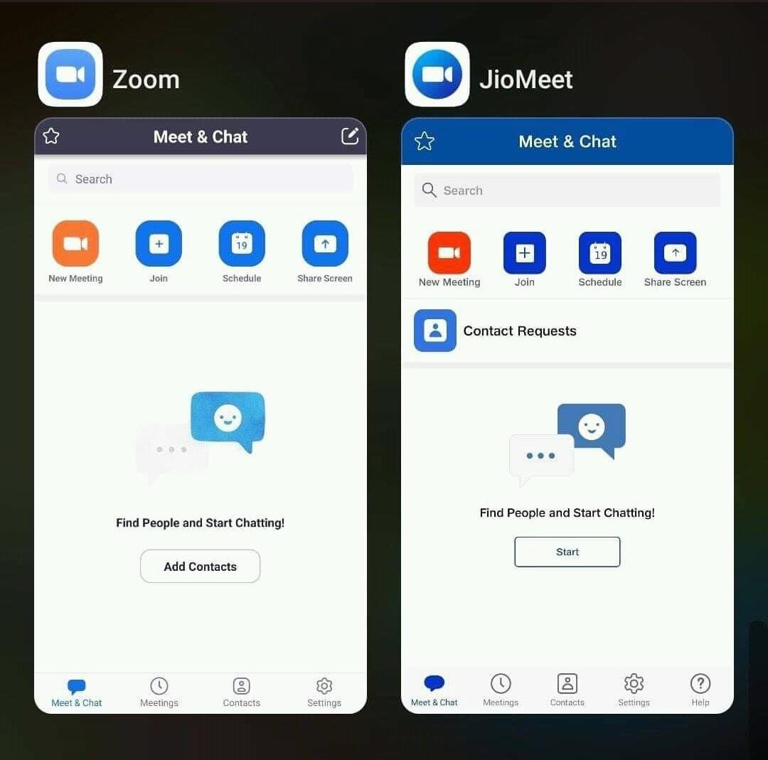
These are actual screens 😉
I am okay with that. If someone following the trend, understanding the user behaviors, making users not to unlearn, and relearn new stuff, It’s excellent! (Good artists copy, the great steals)
The best part is it reduces cognitive loading.
What is cognitive load?
Cognitive psychology theory states that people have a limited number of information they can hold in their working memory. There are three types of cognitive load which every design psychologist must consider while designing any product: intrinsic, extraneous, and germane.
Intrinsic: The task or information that’s presented brings a level of difficulty in order to comprehend and apply.
Extraneous: When too much, irrelevant, or unimportant information is presented, which results in confusion when understanding the content.
Germane: Ensures a person can make sense of the information that’s presented and store it in their memory permanently (foster generative processing).
But as soon as I started using it, I found the real UX issues.
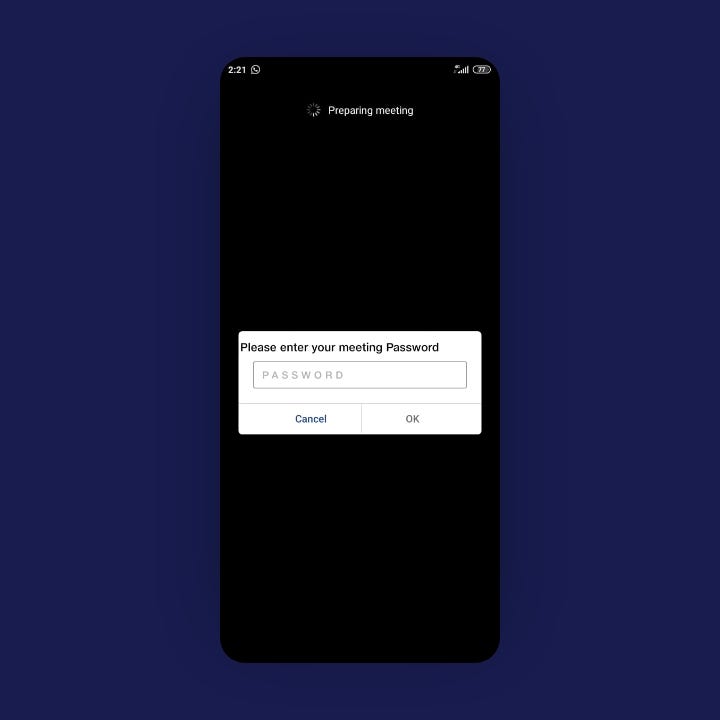
Obviously apart from this frustrating screen.
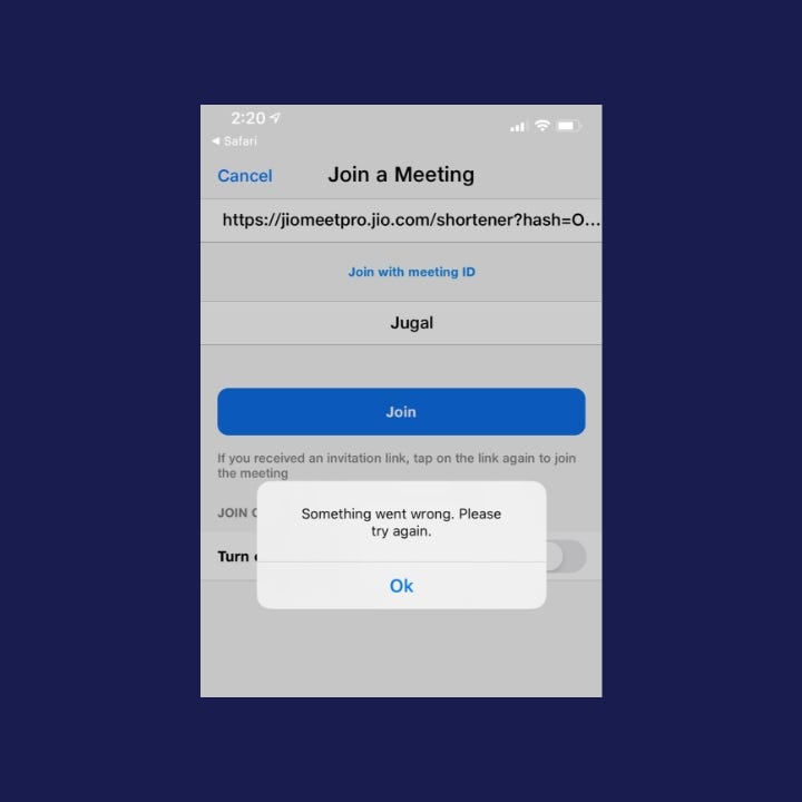
What went wrong? can you please tell me???!!!!
Let’s explore this further.
Anyone using a product should always be able to determine the answer to all seven questions
— Don Norman
Don Norman, the father of UX, gave 7 basic principles of UX.
It seems like while taking ‘ INSPIRATION’ from Zoom mobile app design; few things are missed out.
1. Discover-ability :
Norman describes good discover-ability as: “it is possible to determine what actions are possible and the current state of the device.” Clear focal points (calls to action, images, and headers); visual hierarchy (content structured in order of priority); and obvious navigation systems all constitute good discover-ability and understanding within a design.
When a design lacks discover ability, we have to work harder to understand how something works.

On the video conference screen, it’s impossible to discover that the Speaker’s thumbnails get bigger after clicking on it.
( but I discovered it, Thank you )
2. Feedback :
Norman describes feedback as “some way of letting you know that the system is working on your request.” He also explains that feedback must be immediate, informative, planned (in an unobtrusive manner), and prioritized.
Important information should be immediate and clear.
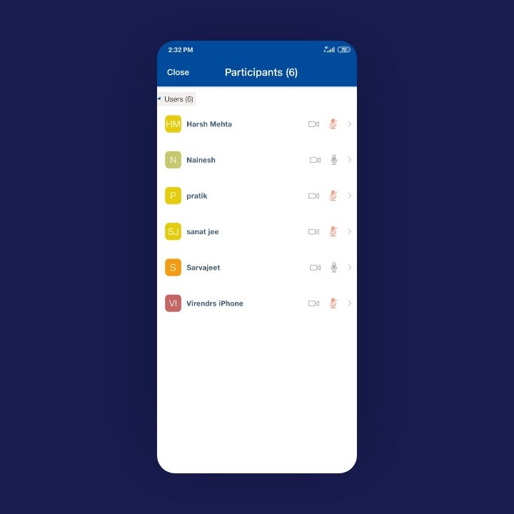
Can you guess who’s speaking?
(obviously, you can make out from the voice)
There are other important layout issues too.
Fitts’ Law.
It is faster to hit larger targets closer to you than smaller targets further away from you.
The most important navigation bar at the bottom, why is it made smaller and not followed the standard size?
Navigation at the bottom is unusually small
Apart from this, there’s no standard grid system used for icons, button size, text, illustrations, etc. design psychologist has not designed system or a grid system and ‘alignment too’.
Forgot ruler, I guess.
Completely missed it!!
And what is more, there’s no interesting Micro interaction.
So there are obviously more points, but I am not a critique. I am just sharing my views (A humble way to say it!)
As a founder of the design firm Leo9 studio, I got a chance to study and work on many customer-centric products, so I shared my thoughts if it helps.
And lastly…
(The real reason for sharing it)
We are willing to work with Reliance JioMeet and help them to make a great Indian product that can actually compete Zoom, Microsoft teem, google meet (not just by copying it)
JioMeet, it’s worth giving it a shot. Do think about it. (If you guys are reading this article, let the best UX Agency in Mumbai help bring up the product’s UX)
Thank you for reading this article.
Finding such great talents is one of the most difficult tasks for a manager or business owner. And an even more difficult task is retaining it, and hence, to get us the right clients we must run to PEO companies!
Do check out best UI UX agency’s work. We now are on DesignRush!